The Library Collection Analytics Dashboard: Optimising Technologies, Strengthening Evidence-Based Decisions
26 April 2024
Purpose & Context
The Office of Information, Knowledge & Library Services (OIKLS) in Nanyang Technological University (NTU) subscribes to a sizeable collection of electronic resources to advance learning and research in NTU. In making decisions on subscription renewals there is a perennial need to examine important information such as usage, user profile, cost, and subscription mode. Such information exists in a disparate array of systems within the Library, in NTU by the Centre of IT Services (CITS) or in external publishers and vendors’ platforms. It is a time-consuming and laborious process with hard deadlines that if missed, the databases will become unavailable for NTU’s access. The team of library staff managing this will burn out during subscription season as most subscription renewals happen at the same time.
In early 2022, a cross-functional project team was formed to work on the creation of a Library Collection Analytics (CA) Dashboard. It comprised 5 members from 3 functional teams who took on these roles:
- Project Manager (from the Collection Development & Finance team)
- Technical Lead (from the Digital Technology & Analytics team)
- Dashboard Developer & Data Engineer (from the Digital Technology & Analytics team)
- Business Lead (from the Resources, Discovery & Access team)
- Data Preparation Executive (from the Resources, Discovery & Access team)
The objective of the project is to consolidate and deliver key information on over 280 electronic resources accurately, clearly, and promptly in an easy-to-use interface on 1 single platform. The interface must support self-service and require minimal technical skills on the part of the staff users. The visualisation of information must also be responsive to changing business queries according to different needs. Successful implementation will streamline workflows and strengthen OIKLS’ evidence-based decisions on subscription evaluation and financial commitments.
Overcoming The Odds
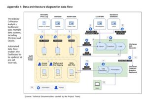
After an initial exploration, the project team learned that creating the Dashboard would involve engineering a system and a holistic service approach that covers the entire data flow from a myriad of data sources to data processing to data visualisation. (Appendix 1 in attachment shows the data architecture diagram for data flow.) The project team set out to overcome many challenges with gumption and perseverance including exploration of a suitable platform, identifying data sources, getting approvals from data owners, and taking an iterative approach in visualising data to draw required insights.
At the onset, the OIKLS had limited experience and skills for developing data analytics services or visualisation dashboards. Recruitment for the right talent was not easy. The project team members accelerated their learning on the job continuously to close the skills gaps. They had to understand the complexity of huge raw proxy data sets, learn to derive suitable metrics and automate calculations. To ensure data accuracy, data cleaning for many huge datasets had to be done. They also had to understand programming and automation of data flows from disparate sources of data. At the same time, they had to build up their capabilities in developing and using Qlik Sense applications.
On managing the stakeholders, the project team had to carefully prioritise many business needs of the OIKLS functional teams and library management, and translate them into suitable dimensions and metrics. They also had to seek collaborative support from CITS colleagues to provide access control for data sheets, while managing the applications themselves within the limits imposed by CITS for on-premise installation of Qlik Sense.
In all aspects of this complicated work, the project team showed resourcefulness and tenacity to deliver a new analytics tool, in a new self-service model, to advance OIKLS’ capability to make sound, evidence-based decisions.
Delivering a New Collection Analytics Capability
By January 2023, the CA Dashboard was ready for use by the library teams in-charge of resource acquisitions, subscription negotiations and the library management.
With the new CA Dashboard where information is accurately and clearly available on a single platform with an intuitive interface, it now takes less than 1 minute to find answers to queries. The Dashboard also has the capability to answer more business questions effectively as additional datasets are included. The simplicity of use, complete with responsive visualisation, makes it a great service innovation.
Previously, to find answers to a similar query would typically take more than an hour as the staff had to first search through several different systems, then export, consolidate and clean data, and finally present it in a fit-for-use format. It would also require the staff to have considerable software application skills and familiarity with multiple systems.
To maximise operational efficiency, the project team sought CITS’ help to optimise technologies and automation in the data pipelines from multiple sources and systems to the Dashboard. Automated data flow enables the Dashboard to be updated at regular pre-set intervals (such as daily for LibCal data, weekly for Proxy data), requiring minimal manual intervention.
The success of the project frees up at least 275 hours of processing work, enabling staff to focus on higher value work and achieve greater operational efficiency. More importantly, it enhances the decision-making capabilities of several teams, and it enables the OIKLS to practice evidence-based librarianship. Librarians are now poised with good data to confidently negotiate high-cost contracts with publishers, resulting in cost-savings in subscription renewals.
Teams in-charge of resource acquisitions and collection development can now build their own queries about the usage of databases sorted by user group and correlated data like cost per use of the resource. This helps collection development strategies to be more targeted and accurate. This Dashboard is also useful for other teams in-charge of academic engagement and service excellence as usage data can show gaps of usage and aid in their planning of engagement strategies for the user groups. In addition, the DIY use of the Dashboard improves internal customer service – divisional heads and leads can now obtain their own answers without having to ask the resource acquisitions team.
Beyond the project, the work and sharing of the project team through training sessions has brought new knowledge to many librarians and expanded their skills sets. The experience and lessons learnt also increase OIKLS’ capabilities in optimising technologies to innovate the development of user-centric analytics services for other functional areas such as the Institutional Repositories Usage Dashboard.
This project is a proud winner of Nanyang Technological University’s SASD Service Innovator Award in March 2023.
Contributed by Wendy Ong, Deputy Director, Nanyang Technological University.